Held Design

The colour of death…

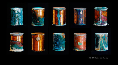
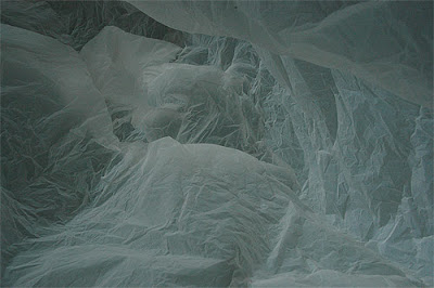
I couldn’t believe what I was reading about these images when I came across them. First, I was struck by the colours, they are amazing, then I read the story behind these strange objects and I was stunned. The images, as far as I could see, are all separate but I thought they would have better impact in a group and so I made a grouping of them for this blog. Read the story of these canisters below…

From 1913 to 1971 five thousand one hundred and twenty one mentally ill patients were cremated on the grounds of the Oregon State Hospital. Their remains were sealed in copper canisters. The canisters were stored in the hospital’s basement until the 1970s when they were moved to a memorial vault underground. The vault was subjected to periodic floods. In 2000 they were removed from their institutional crypt, placed on plain pine shelves in a storeroom, and were left virtually forgotten until David Masiel heard of their existence and photographed them.

They had been soldered shut with seams of lead. Leaked traces of the human remains, a mixture of phosphates, calcium (from the bones) and sulfates, with smaller percentages of potassium, sodium and chloride (the chemistry that makes up from ashes to ashes, dust to dust) combined with the corroding acid in the groundwater to form secondary mineral deposits. From the over five thousand of these unclaimed canisters, Maisel selected one hundred and ten to photograph. He worked on site, in a temporary studio using only natural light.
I “Heart” Tom Gauld


Found this work lately and thought it was a cool idea…

Tom Gauld, a well known illustrator, has paired up with Diet Coke and produced artwork for cans to celebrate “Heart” month in the US. As far as I understand it’s a month to make people aware of heart disease. Anyway, the new cans are really striking and I don’t drink coke but if they were on the shelves over here, I’d buy a few to look at…could make really nice pyramids or just squash them down and make a deadly collage…or could just get out the sketchbook and draw a few hearts of my own, lots of options, so little time, my heart bleeds and that definitely goes against the idea of US heart month, I’m confused…Anyway you can check out his work on tomgauld.com.

Held in the Sunday Business Post

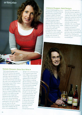
Held Design got a nice write up on the Sunday Business Post yesterday, I have pasted the article in below…

Striking out alone provides impetus for success
28 February 2010 By Jenny Hauser

Graphic designer Helena Duggan used to work for a company which catered mostly for corporate clients, and felt her creativity was being stunted.

When she was let go as a result of the economic downturn, it gave her the impetus she needed to follow her dreams and set up her own graphic design company.

‘‘I was let go the Christmas before last because of the recession. I always said I would set up my own business and this way I was pushed to do it,” said Duggan.

Now it is just ‘‘myself and my computer – we’re great friends’’, according to Duggan.

She said that graphic design was a hard profession to follow when working for someone else. ‘‘When I went out on my own, I actually did better than when I was working for a company,” she said. ‘‘I was able to go out and find work that I wanted to do.

‘‘When you own a company, it seems like people listen to you more and go with your ideas more.”

Duggan completed her degree in graphic design at the Dun Laoghaire Institute of Art, Design & Technology in 2004.

After two years in the world of employment, she packed her bags and went travelling for two years.

However, her creativity was not put on the back-burner during that time. In Melbourne, she enrolled on a creative writing course.

She is only 28 years old and always on the move, at least creatively.

Her latest successful project was a line of illustrated postcards and posters for Kilkenny.

The cards flew out of the door and Duggan is now looking to expand to other counties.

Other projects included designing brochures, t-shirts and flyers for a charity event, Aids Partnership in Africa, as well as designs for the Kells Comedy Festival, a knitting shop and a hair salon.

Held Design celebrated its first anniversary last month, and it has had a busy year. But despite this, Duggan also has her sights firmly set on publishing her own children’s book, which she wrote while travelling in Australia.

What started with a notebook given to her by her sister, ended up as 400 pages about the perils of a shoe called Seamus who finds himself on a rubbish-dump.

Currently, the book (A Load of Rubbish) is on Authonomy, a community site for writers, ranked in ninth place of around 8,000 books by aspiring authors. Each month, the Harper Collins editorial board reviews the top five books and publication is then within reach.

The ambitious designer has her sights set on being in the chosen five, and already has chosen the illustrations for the book on her desk.

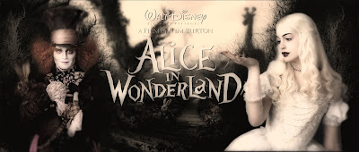
Alice in Wonderland (and a broken”ish” finger)


Hello All, thought you might like these. I was looking at TV last night after a match which I almost broke my finger in (but that’s another story altogether). Anyway yes, so there I was, snug on the couch watching “Run Fat Boy Run” and laughing out loud (it was very funny, I rarely laugh when something is not funny) and what should pop up during the break only an advert for the new Alice in Wonderland film. I jumped out my seat, hitting my finger off the table (the almost broken finger but again that’s another story altogether) and ran to the telly (bad eyesight).

It’s by Tim Burton and although I’m not as well up on directors as I should be, he is by far and away (he didn’t direct that) by favourite. I love his style, his sets are so dark and quirky and absolutely brilliant. He favours Helena Bonham Carter and Johnny Depp in most of his work and they’re great, both mad actors. Anyway so Lewis Carroll and Tim Burton what a combination, went straight online today and pulled up these visuals (brilliant).

Anyway, I’m sure you can guess by now, can’t wait for the film. Enjoy the pics.
Helena

PS a lot of blood, sweat and tears has gone into these few paragraphs. It not easy to type with a broken finger and a dead athletes foot!

The Research behind WTWO Design


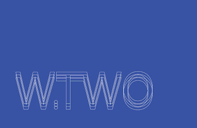
WTWO Design has been an ongoing project for the last number of months and today the business cards landed on my desk. Delighted with them so I have decided to blog on the process.

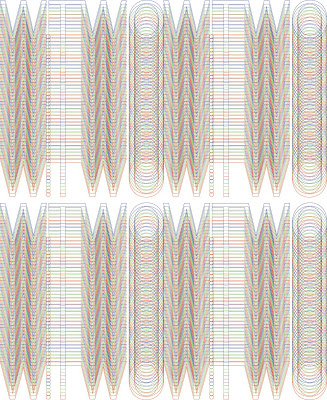
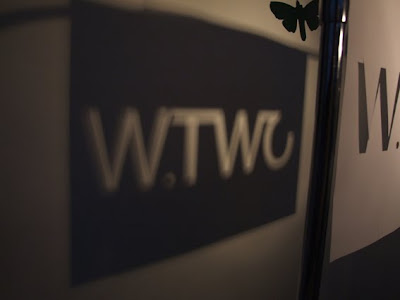
WTWO is a lighting design consultancy so obviously first things first I began to research light and lighting. I played around with the colours involved in light, with the spectrum and finally with colour changing. I developed a logo the client was happy with as a base and then I began my experiments with light. I made a stencil of the logo, hung it up and messed around with light and shadow. Got some really interesting images out of it using RGB colour changing and this became the base idea.
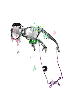
I took my images above and began to try and graphically illustrate them and the results are below. My only problem was trying to print authentic RGB in a printers as they use CMYK colours, not sure if got around that fully but they still look good!

Graphic Design

Goodreads Amazon Etsy google linkedIn facebook twitter GoodReads Amazon Etsy google linkedIn facebook twitter