All posts by admin_held

Please vote for “Rubbish”…

Hello,

Yes it’s story time again. As some of you may already know, I wrote a childrens book and uploaded it onto a website run by Harper Collins publishers to spot new talent. At the end of each month the top 5 books on the editors list are put forward to editors in Harper Collins USA and UK for consideration. There are over 6000 books on the site and mine is currently no.7 it’s popularity really surprised me and I am now a few steps away from the editors desk. I would love to make it but I need help to do so.

I have pasted the synopsis in under the instructions to try and entice a few people to register on the site and back it. If you like what you read please follow these few steps…

1. Go to authonomy.com

2. Click on register in the top right hand corner.

3. Fill in details eg. email and password

4. You will land on a screen called edit profile, don’t bother with it unless you intend to use the site. Just go to the bottom right and press save.

5. Your set up on the site. Now go to the books button in top menu. Click on the “Editors desk” book list and scroll down to no. 7 “A Load of Rubbish”

6. Click on my book, read it if you like but please put it on your shelf, using the buttons panel on the right.

A Load of Rubbish Synopsis

Seamus is an ordinary school shoe who through his own silly curiosity finds himself thrust from a truck into a world of rubbish he never knew existed.

Although inherently shy and lost without the aid of his outgoing Brother Charlie (right shoe), he must find his feet, so to speak, in this wasteland.

Through friends and mentors he gains along the way such as ‘Nelson’, an old mahogany door who doubles as a hostel on Lodgers Lane, and Tess, an eccentric English dictionary and thesaurus who resides on Joyce Avenue, he begins to pick up snippets about his unfamiliar surroundings.

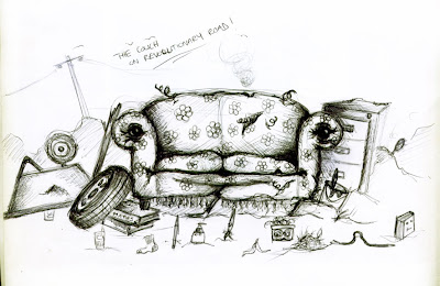
From Credit Limits, the only means through which rubbish can aspire to be recycled, to the Triple R Treaty, and the undercurrent of hostility towards the Breeders, Seamus has a lot to take in. However, with the aid of a repertoire of colourful friends, a new job and a comfortable home in The Couch, he begins to settle.

It is only when KP, a beautiful newspaper who has journalistic aspirations, reappears mysteriously the night of Sam’s going away party and hands Seamus a cryptic message that things begin to go askew. Seamus must take a dint to his pride, find Jack and open himself up to a world of deceit.

The dump dream begins to disintegrate around him as he discovers flaws in the apparent transparency of the credit system, makes dangerous enemies in high rankings of society and comes face to face with Adam and his army; a rat whose lineage can be traced back to the beginnings of creation, and whose lust for revenge has seen his ancestors put a paw in such dirty deeds as the Black Death and the Great Stink of London.

Seamus is an ordinary shoe but it is going to take an extraordinary courage to fight for his friends and stand up for the dump he now calls home.

Oh, and somebody keeps lighting fires!
BBC Winter Olympics Advert…


Hi All, bit of a coincidence today…

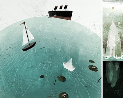
A while ago I saw the advert for the Winter Olympics on BBC and thought it was one of the most brilliant designs I have ever seen. I love the style, it feels kind of textured and it really made me sit up and take notice. Anyway, my head is a bit of mess so obviously after I took notice, I quickly forgot again until today. Today I found Jon Klassen, an illustrator and a Canadian living in California. The video was directed by Marc Craste and Jon Klassen was co- designer.

Some of his drawings are above and I will also post the advert for the winter olmpics once I figure out how to post videos.

A Sneak Peak…


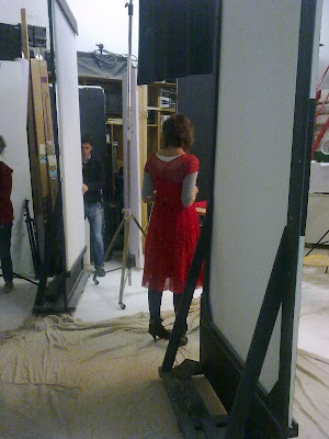
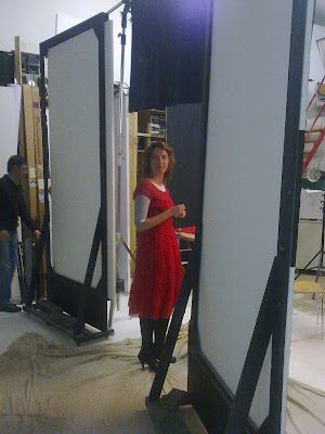
Here’s a sneak peak behind the Prudence photoshoot I did yesterday. The shoot was about recessionista’s or in plain english, women who started business in the recession. Held Design was picked up and I got a call out of the blue from Annette at Prudence.

I was asked a few questions, it was a very informal and relaxed interview which helped as I was just a little nervous and then it was my turn to get shot! First was the individual pic and then a group one with 9 other girls all recession start ups. It was a brilliant experience all the staff at Prudence were great as was Tiberio, the photogrpaher for the day.

The article will be out in the march addition of Prudence.

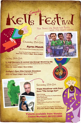
Design for Kells Comedy Festival 2010


The Kells Comedy Festival is back for another year.

Just finished the design and I’m really happy with it. This year I based it around the book of Kells. I redrew characters from it’s many pages, emphasising how comical some of them are, those monks had brilliant imaginations, they were the designers of their time! Anyway I then got an old parchment background, to give a textured feel to the posters and tickets. Pretty happy with the result!

Anyway it promises to be another great festival, all down to the hard work of Fred Cooke, he’s a comedy genius in his own right but turned organiser for this festive affair.

Angels in the Castle


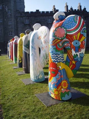
There’s a couple of angels hanging around the castle…

Read about this exhibition by Nollaig Fahy in the paper and decided to head down for a wander. I think they look great in front of Kilkenny castle and I’m delighted to see that the doors are being opened more to things like this, next step a concert I reckon although I’m not sure if the council would be up for that.

Here’s the piece from the paper

“Neil Jordan, The Edge, Uma Thurman and other Irish and international celebrities bring messages of hope to Kilkenny this week with the ‘Angels – Beacons of Hope’exhibition currently taking over the grounds of Kilkenny Castle.

The spectacular exhibition is a showcase of more than 50 colourful, eight-foot tall angels individually designed by Irish and international musicians, celebrities and sports people.

Artist Nollaig Fahy transported his exhibition of the larger than life-size angels to Kilkenny in a bid to raise much-needed funds for charity but also to bring a message of hope to the Marble City.”

Pop down for a look if your about, I think it’s worth it.

TCK, the concept behind the design


Since the success of The Constant Knitter and with a little advice from a friend in the know, I decided I would add a bit of usefulness to my blog. Give back some info instead of using this as a space to randomly rant or throw up some unexplained work, so here it goes…

A little insight behind the thinking that went into The Constant Knitter.

I always start with a concept and this concept was brilliant. Rosemary wanted something a little quirky, maybe slightly off the wall, a bit out there, basically something different. She was totally and completely open to ideas and I LOVE THIS. The more open the better.

First things first, I took my influences from Rosemary, she loves colour, wears a lot of it and always looks bright, point in my notebook.

Secondly, wool!

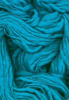
The site is all about wool and knitting. The underground culture of knitting is mad, actually absolutely mental. With so many groups and hidden societies out there it’s like an underground rebellion, so of course I had to investigate that. I took wool samples and played with them endlessly, making the letters, scanning the wools, basically having fun. It’s fun with a purpose though and I found that the material itself combined with all the different types of stitches created really intriguing patterns upclose. I ran with this idea, asked Rosemary for some of her favourite pieces, took them home and put my scanner to work.

Thirdly, I took a selection of different typefaces or fonts (there seems to be an argument in the design world about what to call these so I’ll call them letters) each letter was a different font (ah there I go again. Just confused myself!) as a wanted to create a zanny feel to the logo, to show the diversity of knitting and knitters. I placed the scanned wool pieces behind the letters and cut them out…the end result is the logo you see now plus a few little tweaks.

The images above are some of the research stages I went through, this is what I love about design. It’s an open process, you may think your going one way with a piece and then a little bit of exploration leads you down a totally different path!

Hope you enjoyed this post, I may do more of these…um.

A Little Prudence for The Constant Knitter

The Constant Knitter gets a great mention in prudence magazine! After picking up Rosemary’s leaflet in Cafe Notte, a journalist from Prudence asked her to take part in an article on entrepreneurial women. A full day of photos ensued and Rosemary and The Constant Knitter got great coverage in the recent Jan/Feb edition.

I’m delighted for Rosemary and (whispering) for myself.

A Little Recognition…

Just got a nice little present for a Monday morning. Have, this past hour, been informed that “The Constant Knitter” has made it onto the Irish House and Homes magazines top 100 list of funky design start ups. Held design did the full branding and web design and we are delighted that Rosemary has got some recognition. (A little happy for myself as well, just reaching around now and patting my back!).

Ruairi at Kro Solutions did an excellent job building the site and you can read his blog here. As you can see we’re all pretty happy!