Monthly Archives: July 2017

Perfects Little Brother…
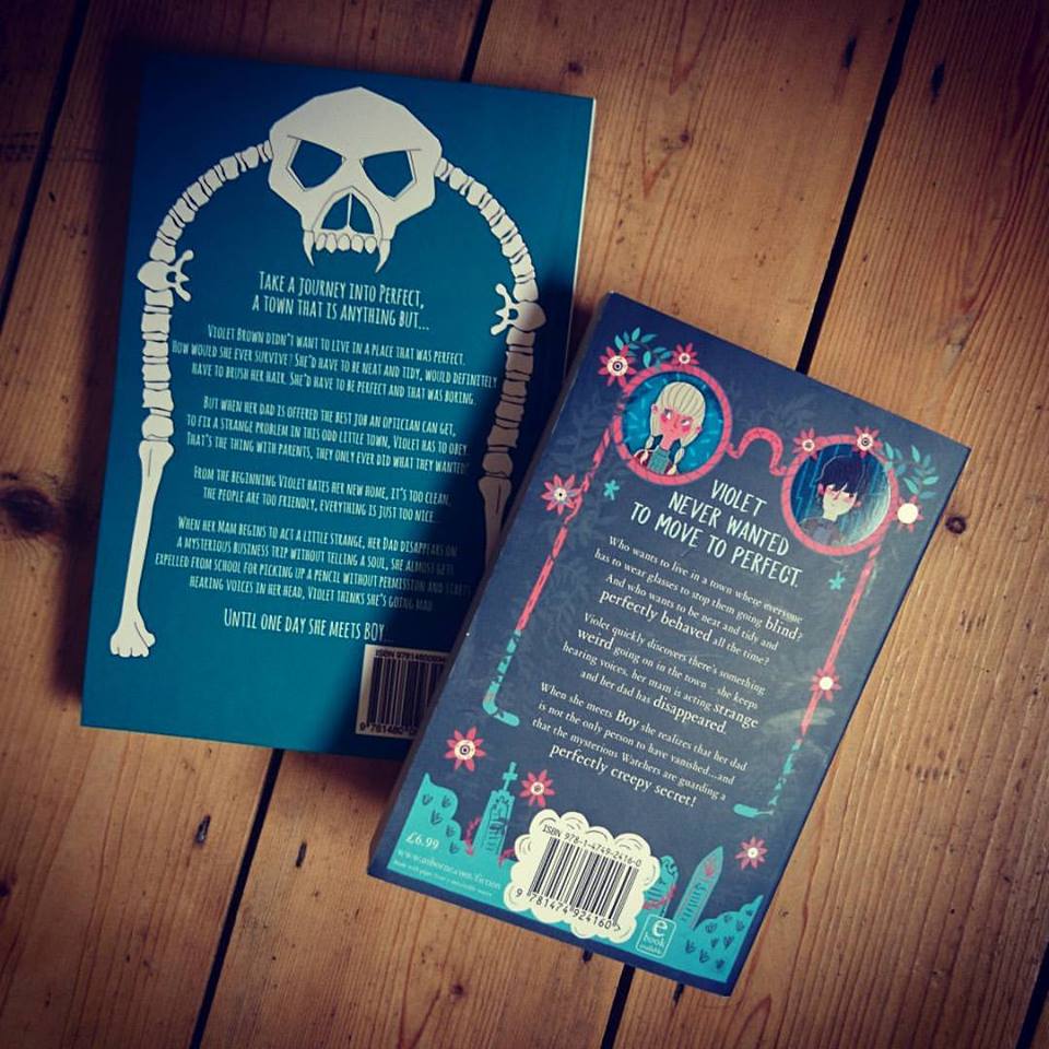
I remember when I self published A Place Called Perfect I wanted to make sure it was as polished as possible so that it didn’t look out of place on any bookshelf. The publishing world can be hard on self published authors and if you want to get out there into shops and garner reviews you need to look professional.
I decided to self published because it seemed to be the way the industry in America was going. A lot of authors self published, got reviews and sales figures then approached a publisher. I’m a graphic designer, it’s my job to design things so I thought it was a logical step to self publish. I finished the book, got in an editor and started to design the cover.
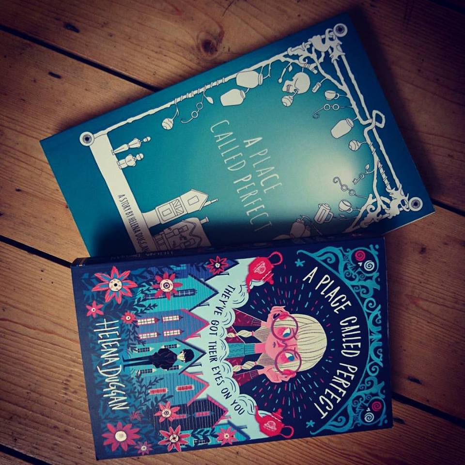
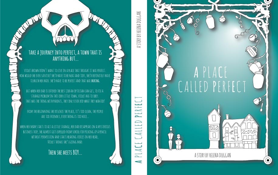
Perfect is a book for both boys and girls and I wanted the cover to not alienate anyone. I chose a neutral colour, a sea green. Then I illustrated the town and the Archers and framed them with lots of elements from the story such as eyeballs, skulls, tea, jars and of course the glasses. I chose to leave the illustrations in white outline as I felt they looked stark and slightly spooky against the green.
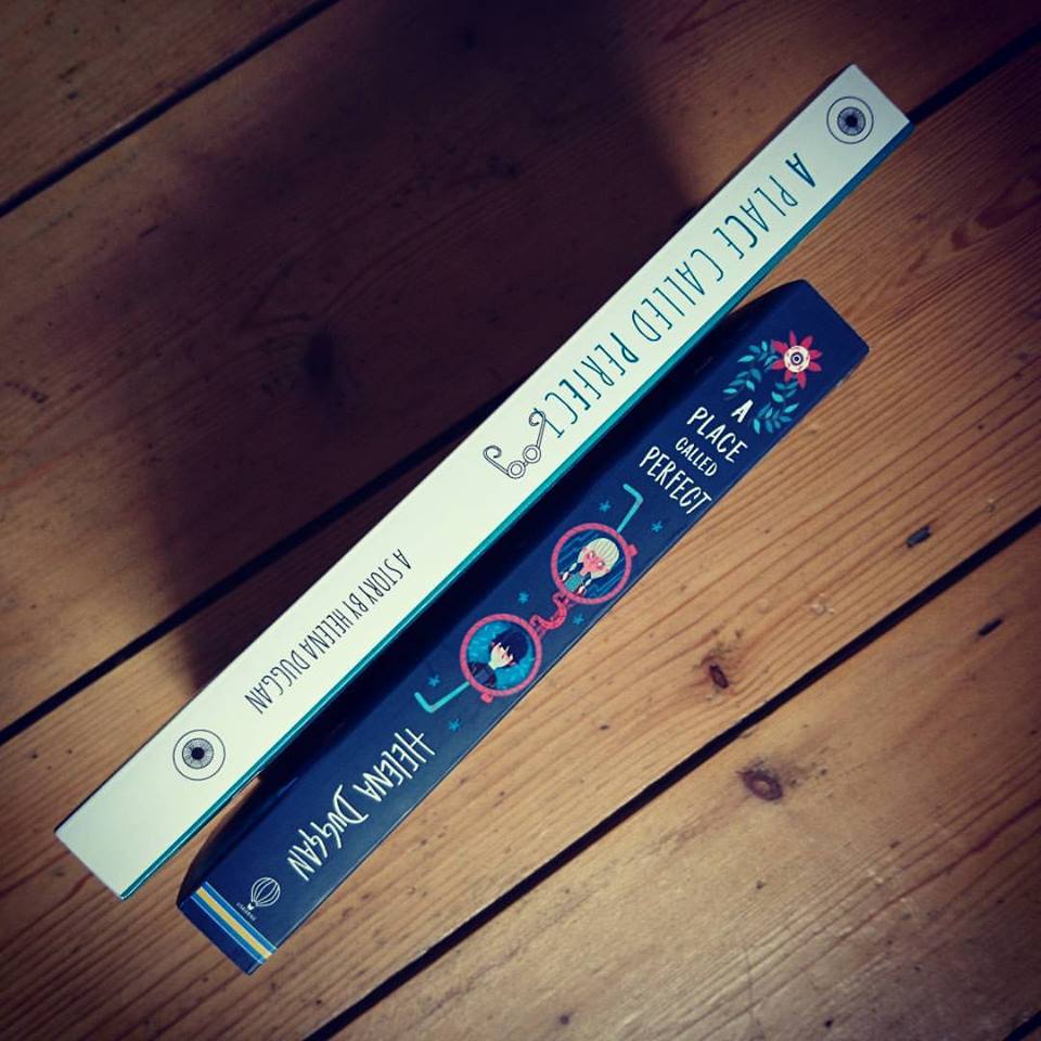
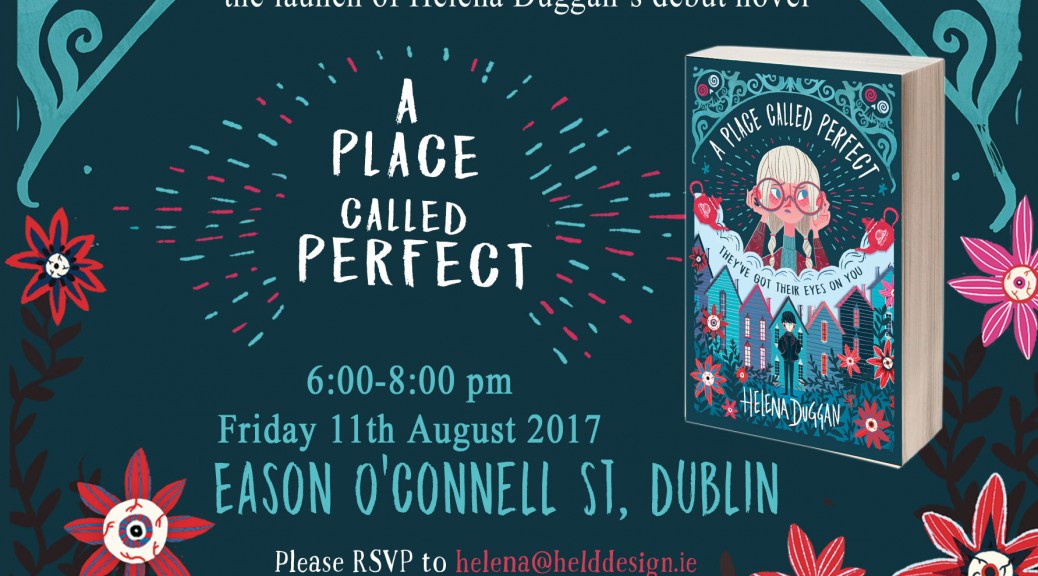
I was delighted with the outcome of my self published version, it didn’t look amateur at all I told myself. Now I’m rethinking that notion. As I look at the two covers together I’m beyond happy with Usborne and Karl Mountfords interpretation of the story. The cover makes the older version pale.
I can’t disregard my self published attempt though, it helped in a huge way to get a publisher. I would never take it back and it will sit proudly on my shelf alongside it’s new big brother!
