The Brothers Grimm and Charles Avery…

I’ve been reading Grimms Fairytales lately, I really don’t agree that kids should be mollycoddled (not sure if it’s a real word but you know what I mean), I think stories that are purely sweet and nice and full of fluff and puppy dogs tails (although that is a little gruesome) are under estimating children. I really believe they see things differently than us and everything has a little magic to it for them, I think for a story to have dimension for kids it needs a little darkness, and so to bring this full circle, that is why I went back to Grimms Tales, to see where our original Fairytales started.

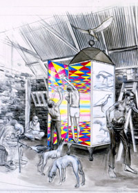
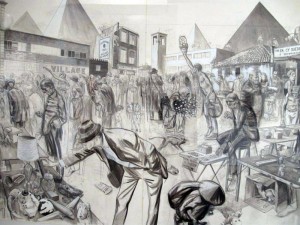
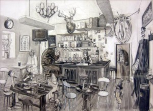
So, today when I accidently found The Islanders An Introduction by Charles Avery it reminded me straight away of Grimms. I love his almost human worlds, full of unusual characters, the weird and the wonderful. I’ve uploaded some images above, see what I mean!
Bendy Necks and Pillow Fighting Knights…


Saw these two pieces of work over the last few days. Both oils on canvas I think.

I love the humour and thinking behind Gideon’s work, the two pillow fighting knights. I wonder if they ever won the hand of a fair maiden. I mean a muscular man with a horse and a lance is a much more enticing than two sissy’s armed with pillows but then again there is a lot to be said for the “peace not war” attitude, even at the round table.

Titus work is one of those pieces you could get lost in. I’d love to put it on my wall and stare for a while (at it, not into space) the more I look at it the more I discover. It’s a bit like a maze, I love when I have to wrap my head around something, although it can be pretty painful, even with a bendy neck!

Art in a Shoe Box…


Found this, this morning and thought I better blog about it as I think it’s a great idea and gets a little inside the head of some of these great artists. Also it takes their art out of the world of the elite and makes it accessible to all, I reckon although many would probably disagree. Modern art and myself have had somewhat of a shaky relationship, we tend to disagree, there’s lots of misunderstandings and we basically try hard but don’t get along, anyway this exhibition has helped mend a few bridges. It’s also all in aid of Kids Company who work with vulnerable children so. Also you have to have a look at the site shoeboxart, see what you think…

Perfect branding…

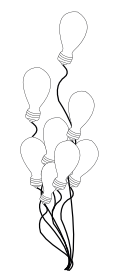
Found this design today and really love the idea. I think the design of a branding has to be relevant to the person, their ethos and of course their business. It also has to create a stir, make people talk and ultimately stay in their mind so that when they are asked, “Do you know someone who does such and such…” they will always remember you.
This branding for an environmental consultant does exactly that. Brilliant and so simple.